The New English Landscape
Field Station / London, Nov. 2013ISBN 0992666902 (out of print)
ISBN 0992666902 (out of print)

The successor to ‘350 Miles’ continues the fruitful collaboration between writer and photographer; on balance, the essays seem a bit more prominent here. The publication builds on the observations in the first book, but expands them to a broader context, deepens the level of enquiry and draws on a wide-ranging list of sources. Referring to a 2003 Country Life survey which awarded Essex zero points for landscape quality, he questions how quality of landscape is assessed and examines shifts of landscape æsthetics since the second world war. As reflected in the title, the book develops lines of enquiry which, although based on his observations of the Essex landscape, go far beyond the county’s boundaries – a bit like ‘Learning from Las Vegas’ drew lessons from what was then considered a non-city, which were to leave a profound impact on 20C architectural history. The book – less travelogue, more academic essay – is passionate and rich in social and cultural history, and the writing is imbued with Worpole’s affection for the nonconformist, the ‘renegade’, the utopian and the overlooked and marginalised. Orton's photographs, which in 350 Miles were quite often paired with text on the facing page and were thematically closer to the subject of the essay, here appear less obviously related and – separated from text, and in all but a few occasions faced by blank pages – are more like visual essays in their own right.
The book has been reprinted once, but sadly the second edition is now out of print. Copies can still be found on Amazon or Abebooks.
A great review of the book by Bob Gilbert can be found on the Livingmaps website.
Ken Worpole runs a blog with the books title, on which he regularly posts - recently mostly reviews of other books on the subject. Also refer to his personal website on which he posts updates on events he contributes to or is otherwise involved in, and for his other great work.
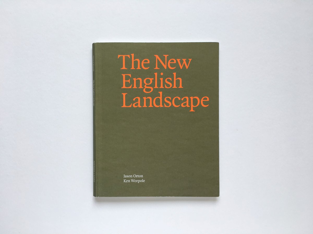
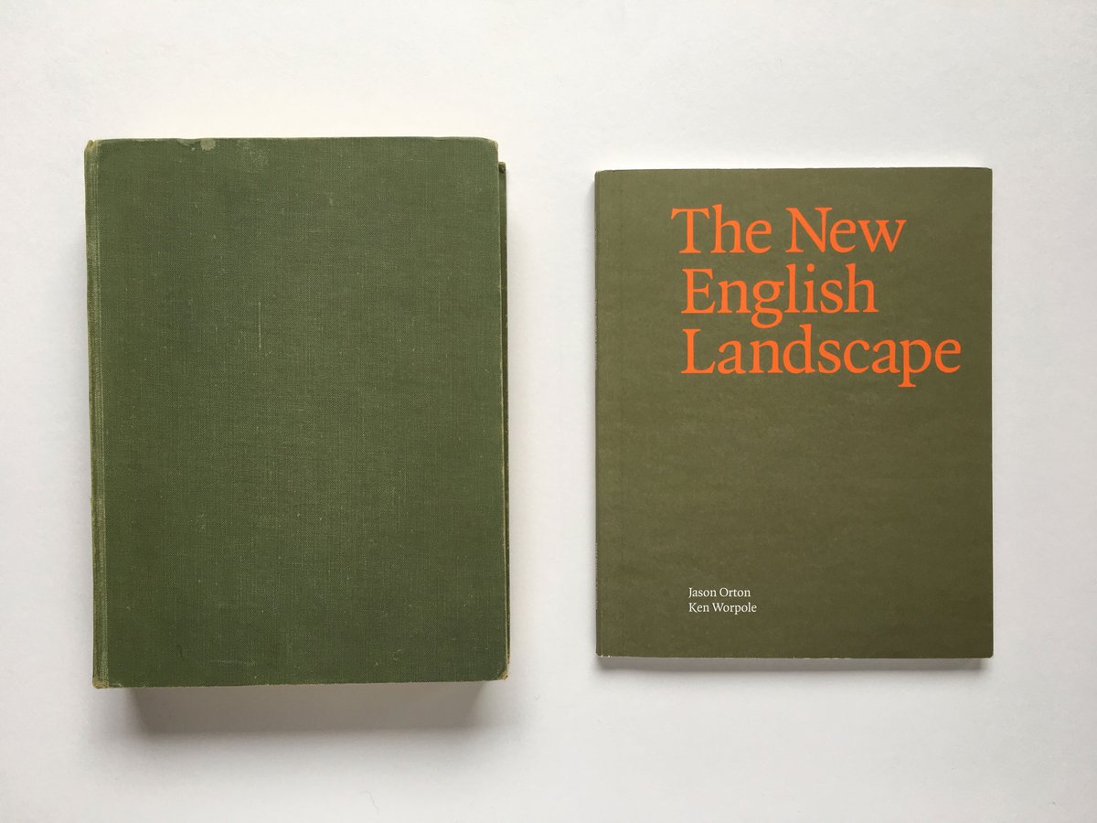
The book is beautifully produced and features excerpts from the map accompanying 'The Great Tide' on the end papers. The book's title shines in bright orange against an olive green background, which made it stand out quite prominently on the display shelves in book shops. And it wasn't until recently that I understood what I had considered to merely be a great piece of graphic design might in fact be another subtle reference to Grieve's work, when sitting the two books next to one another:

The Great Tide – The New English Landscape